Case - Bigmishki
Optimizing SEO for the landing page was irrelevant, so it was proposed to develop a full-fledged online store.
- UX/UI design
- Development of an online store
- Filling the online store
- SEO strategy
- On-page optimization (SEO)
- SEO promotion




At the initial stage of website development, the objective was to create an online store specializing in teddy bears.
Over the course of more than 2 years, we have evolved the website. During this time, it transitioned from being solely a teddy bears store to an online store of emotional gifts.
As a result, an additional objective can be outlined:
- Expanding the upselling functionality
- Modules for sale additional products and packaging
- Improving the functionality to increase the conversion of the online store
- Make it more modern
- SEO tasks
- Bypass all dealers and manufacturers of teddy bears in Ukraine in the search results
- Bypass major players such as: Rozetka, Prom.ua and OLX message boards (Be higher than them in the search results)
The project has currently achieved all the goals described above and continues to develop.
FOR THE MONTH
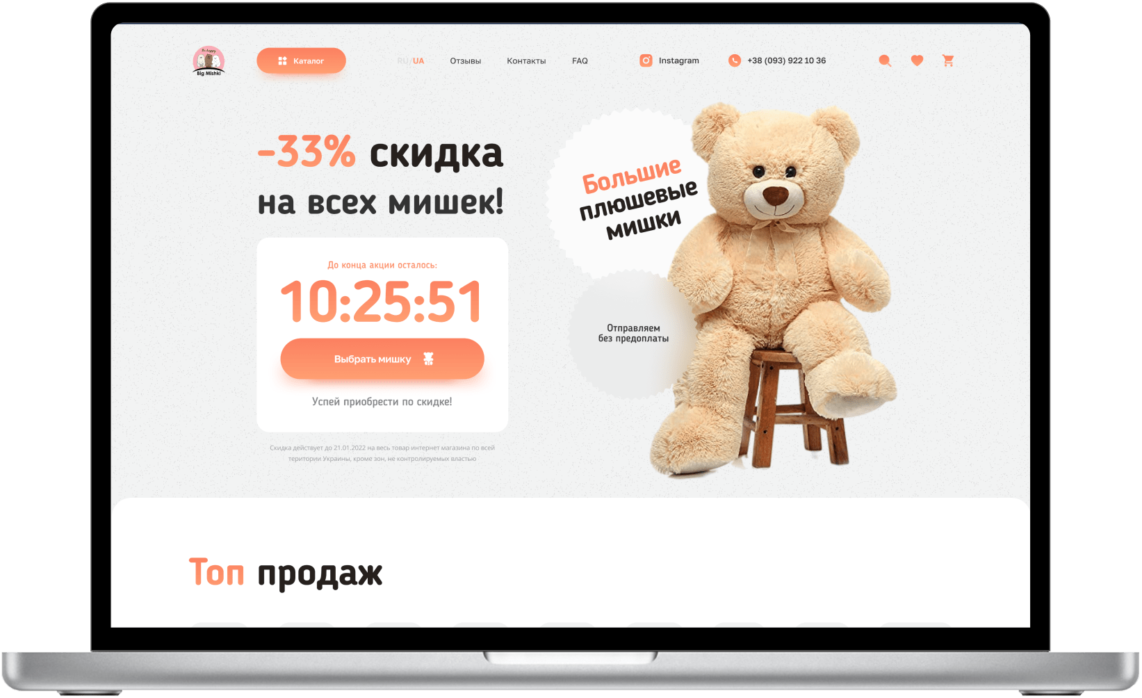
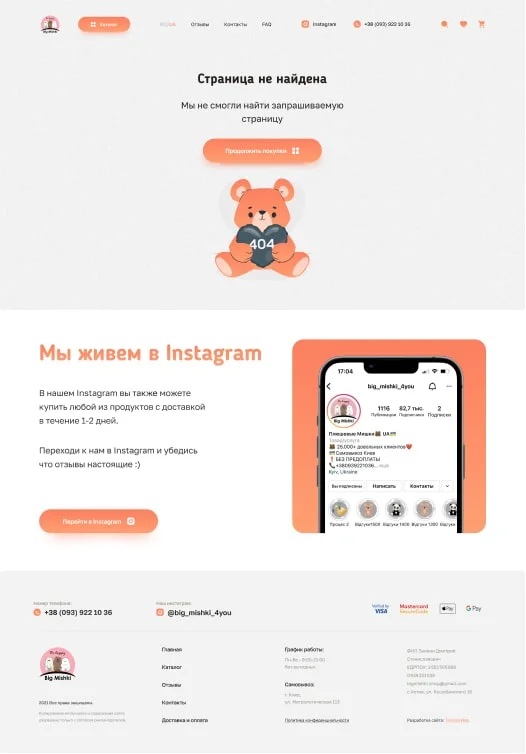
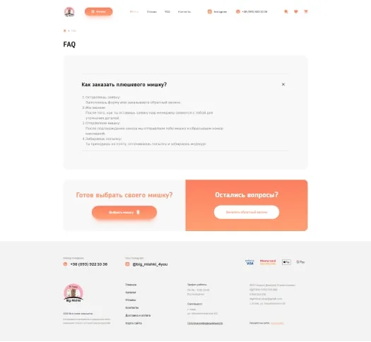
The design is made in warm colors, the main clients of the site are men buying gifts for their loved ones, and adults buying gifts for children.
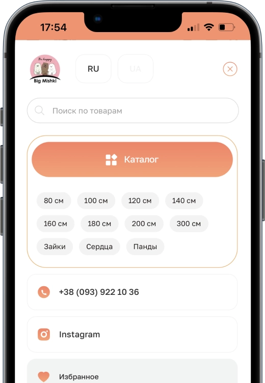
The design turned out to be universal. Pay attention to the drop-down menu for the online store.
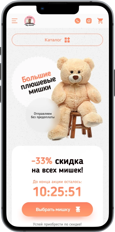
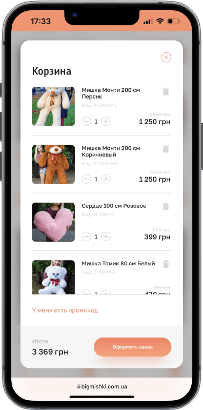
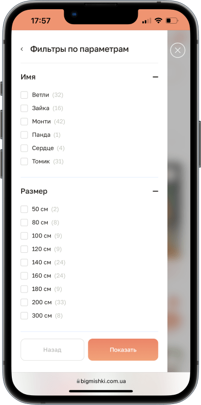
For the convenience of the mobile version, filters are hidden in a separate interface, which is called using a button.
Additionally, a 'Catalog' button has been added, enabling users to navigate to any catalog page within the store.
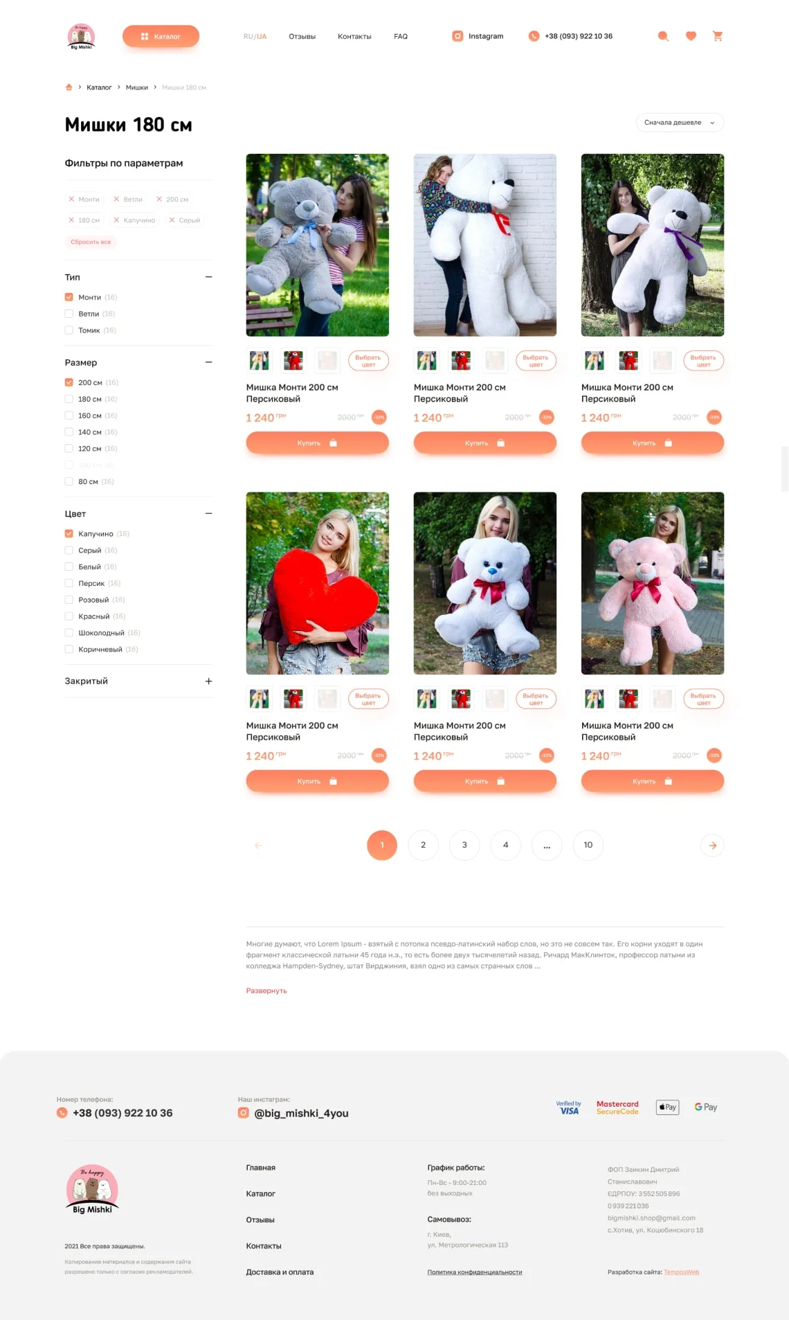

The online store's product card is dynamically updated quarterly, providing new functionality to help increase sales.


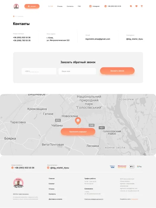
Designed an intuitive, logical and maximized user-friendly interface for all current devices.
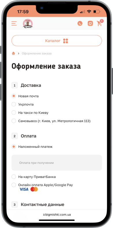
Go to the website, put the item in your cart and pay attention to the sale items in the cart.
Do you want
to become
the market leader
in your niche?

We will help you increase your profits
by 2-3 times or more through a comprehensive approach and the right strategy.

