


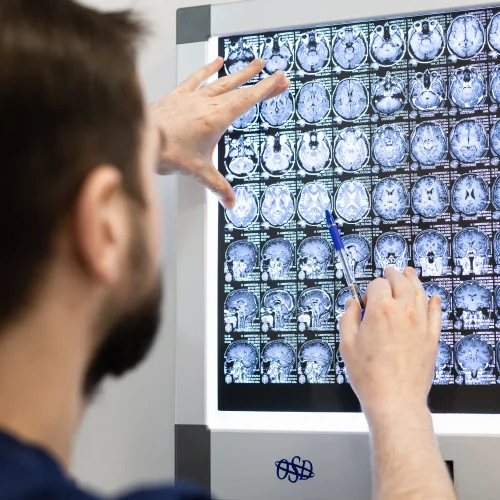

The client approached us before the clinic was opened. The client's requirement was to create a strict and conservative design.
Our goal was to give the website a modern look and make it understandable for clients, as the topic of pain treatment is not sufficiently disclosed on the Internet.
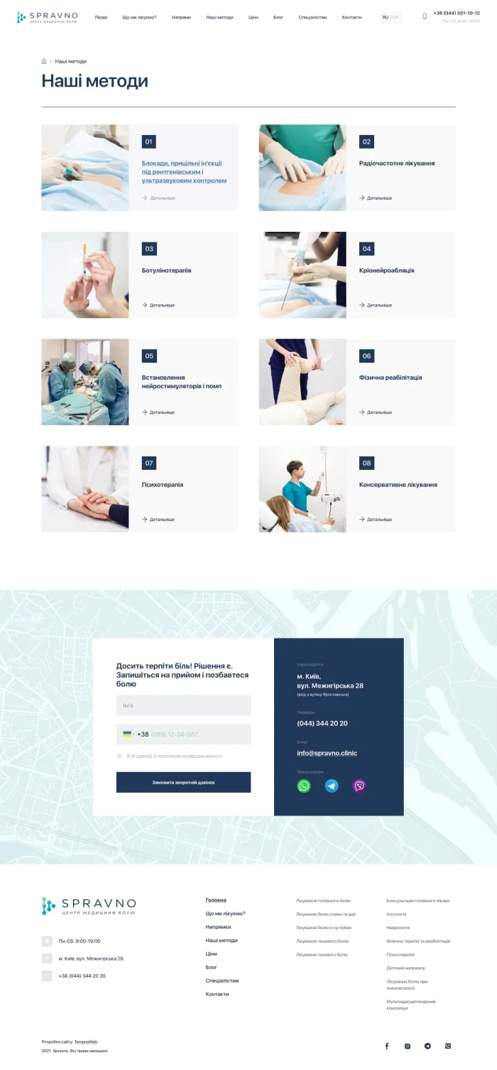
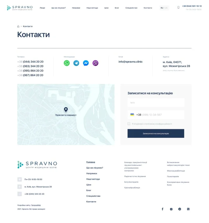
The design of the site uses elements of Swiss design, in particular, an emphasis on simplicity, fonts, straight lines and graphics.
One of the unique elements is the illustrations of the sections of the site. The home page contains a video that makes the site more interactive and introduces users to the clinic.
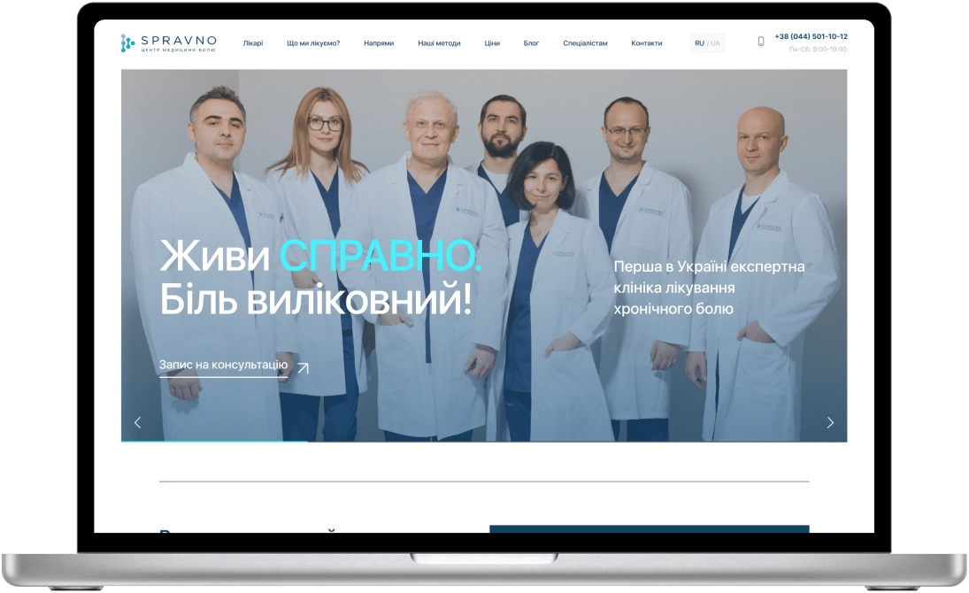
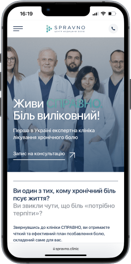
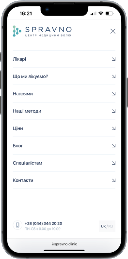
The page content is divided into 3 parts:
Header: has a title, illustrations and a conversion button.
Left side (content):structured with bullet points, icons, in Swiss design style to make it easier for users to perceive the content.
Right side: contains site navigation elements and additional conversion components.


We worked on each internal page in detail, preserving the unity of the design concept and functionality.


Do you want
to become
the market leader
in your niche?

We will help you increase your profits
by 2-3 times or more through a comprehensive approach and the right strategy.
0